How we created an animated, responsive README
Adding responsive images, SVGs, ASCII, and airplanes
For an open source project, your README is your landing page. Using it to stand out makes a big impact on convincing developers to explore and adopt your tool. It is a window into your app (and you want users to enter it).
READMEs are written in Markdown, a format that is intentionally simple in its design. Usually, you are working with a very limited set of tools like text, bullet points, and images. Luckily, GitHub’s flavor of Markdown provides a lot more than people realize (like a lot of HTML being supported).
At Scalar, we take full advantage of this to create responsive and animated elements that make our README pop. Here’s all the details:
Creating responsive images
The Scalar app is responsive, why shouldn’t our images be? An API client or API reference has a ton of information included in it. For you to see all that detail, you need the right size of images. One size does not fit all.
Normal Markdown images only enable you to put one size. Even if we used the <img> HTML component, we’d still be in the same boat. SVGs on the other hand, enable us to do cool stuff like this:
This works by being an SVG with a <foreignObject> inside of it and <html> inside of that. The image remains centered in its container and is able to use CSS to control the display of the potential images. Here is a simplified example of how the code looks:
<svg xmlns="http://www.w3.org/2000/svg" width="100%" height="100%" viewBox="0 0 500 500">
  <foreignObject width="100%" height="100%">
    <div xmlns="http://www.w3.org/1999/xhtml" style="display: flex; align-items: center; justify-content: center; height: 100%;">
      <img src="desktop-image.jpg" style="width: 100%; max-width: 400px;">
      <img src="mobile-image.jpg" style="width: 100%; max-width: 400px; display: none;">
      <style>
        @media (max-width: 450px) {
          img:first-of-type { display: none; }
          img:last-of-type { display: block; }
        }
      </style>
    </div>
  </foreignObject>
</svg>
And we didn’t just create one of these SVGs, we did two: one for light mode and the other for dark. Once you accept the fact that people use GitHub in light mode, you’ll probably not want to blind them with your images in the mode they choose.
Luckily, GitHub makes this a lot easier than responsive images. You simply need to add #gh-light-mode-only and #gh-dark-mode-only tags to add to the images like we do here:
	<img width="830" height="520" src="https://github.com/user-attachments/assets/7c4d4971-a6d9-457d-a7ab-11894889f6f9#gh-light-mode-only">
	<img width="830" height="520" src="https://github.com/user-attachments/assets/0e3ffca5-8912-487a-a390-fef0e8222c35#gh-dark-mode-only">
Adding Real ASCII in real Markdown
As a tool built for developers, we’re big fans of the ultimate art form of developers: ASCII. We use ASCII art in a bunch of places in our app, but unfortunately, Markdown doesn’t handle it well.
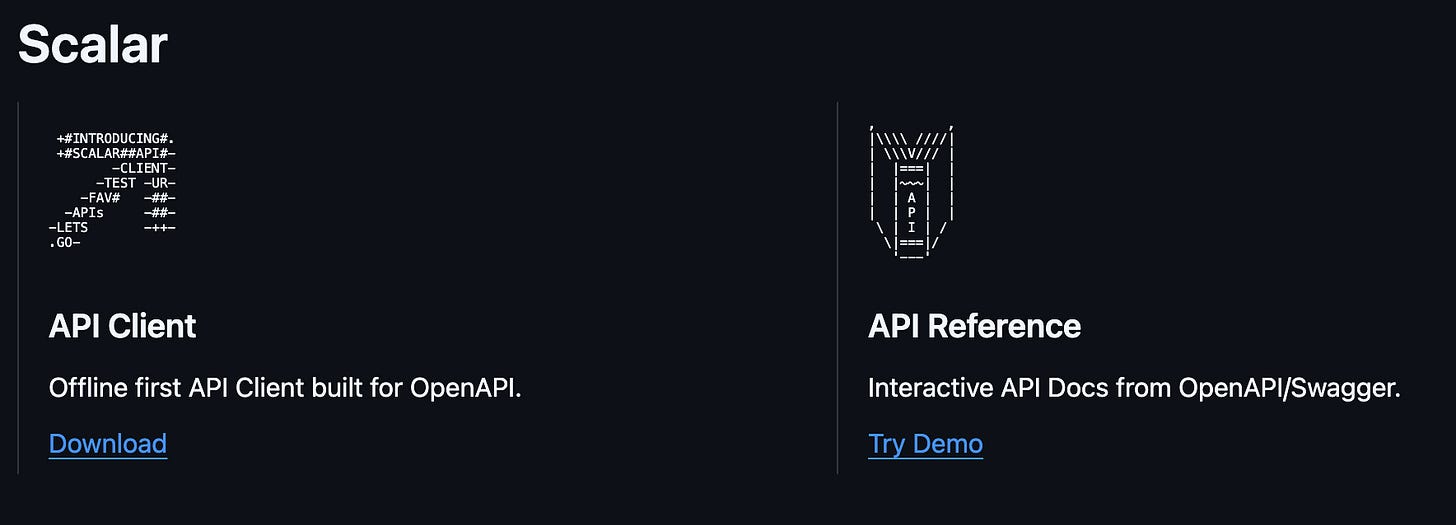
Instead, we use SVGs with foreign objects (again). This lets us do this:
As you can see, this enables three things:
Use ASCII in our README
Have a horizontal split for our two different products
Have both link to the correct spots
This is done with a combination of HTML (for the links) and SVGs that look like this:
<svg xmlns="http://www.w3.org/2000/svg">
    <foreignObject width="100%" height="100%"><script xmlns=""/>
        <div xmlns="http://www.w3.org/1999/xhtml" class="fixme">
            <div class="markdown-body">
                <pre class="markdown-code">

 +#INTRODUCING#.
 +#SCALAR##API#-
        -CLIENT-
      -TEST -UR-
    -FAV#   -##-
  -APIs     -##-
-LETS       -++-
.GO-
          </pre>
                <h3>API Client</h3>
                <p xmlns="http://www.w3.org/1999/xhtml">Offline first API Client <span class="mobile-copy"> built for
                        OpenAPI.</span></p>
                <p class="linkcolor">Download</p>
            </div>
            <style>
                * {
                    margin: 0;
                    padding: 0;
                    box-sizing: border-box;
                }

                .markdown-code {
                    font-family: ui-monospace, SFMono-Regular, "SF Mono", Menlo, Consolas, "Liberation Mono", monospace;
                    white-space: pre;
                    font-size: 0.5rem;
                }

                <!-- more styles... -->
            </style>
        </div>
    </foreignObject>
<script xmlns=""/></svg>
Creating animations that will knock your socks off
Now, all this is cool so far, but you could mistake it for any other GitHub repo. Something that would be totally unique to use is some sweet, sweet animations running in our GitHub repo.
We love our contributors. What better way to credit them than an animated shout out in our README? Contribution is a key piece of being open source after all. Again, we use SVGs and foreignobjects.
Our first iteration of this was a pillar in a room with each of our contributors projected on it.
This works by:
Creating “walls” using background textures and rotations.
Defining a 3D, rotating cube with ASCII-style avatars with commit info.
More ASCII art with usernames, number of commits, and line additions/deletions.
A CSS scroll animation to scroll this ASCII art continually upward
Eventually, we got bored of this and moved airplanes. The airplanes are HTML and they are animated with CSS.
This works by:
Creating two banners with the contributor name, commit count, and stats as well as the ASCII art of an airplane.
Using
@keyframes, they move from left to right continuously at slightly different offset speeds.The plane bounces continuously by repeatedly fading in and out of slightly different planes.
The banner contributor text and color change based on
@keyframesas well.
Why not use a gif? Other than people not knowing how it is pronounced, gifs have worse performance and are honestly more difficult to make for developers used to coding animations by hand. Since we can show off our programming chops, why not do it?
Why all this work to make our README look cool?
It’s fun.
It makes us stand out.
When so many READMEs are the same, one that plays with the limits of it as a form really stands out. As an open source project reliant on our GitHub repo to attract and convince users, this makes a massive difference. We hope our experience will be helpful if you want to do the same.


